Short Bit: David Lynch, the Retrospective at Pennsylvania Academy

I just finished Twin Peaks last night. I am very glad I watched this early 90’s soup opera murder mystery directed by David Lynch. Despite being canceled after two seasons, it gathered a large cult following, and I can see why. It was ahead of its time for featuring complex idiosyncratic characters like Agent Dale Cooper, pretty impressive set designs and just over all stunning cinematography. So I decided I wanted to know more about director David Lynch. Well it turns out my timing could not have been more perfect as the Pennsylvania Academy is hosting a retrospective of his work titled “David Lynch: The Unified Field,” starting Sept. 13. I was, as you can imagine very excited to discover that Lynch was a trained and skilled visual artist as will as phenomenal director. I don’t think its too much to suppose that his background in art making facilitated in part his success as a film and tv show director.

Here is an article about the exhibition I encourage you to read: http://www.nytimes.com/2014/08/31/arts/design/museum-show-for-david-lynch-who-began-as-a-visual-artist.html?ref=design&_r=0

My favorite part of this article is this quote from executive director of the Drawing Center in New York Brett Littman, “He’s not James Franco.” Mr. Littman, who curated a smaller show of Lynch’s photographs and works on paper, is referring to the art world’s collective hesitation in embracing Lynch’s work. Often art administrators become suspicious of actors and musicians claiming they are artists also. But thankfully Robert Cozzolino, the senior curator of the Pennsylvania Academy, saw fit to gather five decades worth of paintings and drawings form Lynch and organize this retrospective.

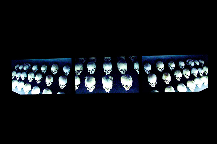
Lynch’s paintings fascinated me. As a collection they are dark, atmospheric renderings that feature ambiguous images on richly worked surfaces. He gives them names like “Rat Meat Bird” and “Nothing Is Making Any Sense For Instance Why Is That Boy Bleeding From The Mouth” that cause me to reflect on visceral and bodily topics reminding me how venerable my body is to injury. Some of the paintings even look much like open wounds. He also has a series of drawings titled “Bunch” featuring thick black marks of abstract design on tan colored paper. Some of the imagery contained in this series are skulls, bones, simplified architecture, and graphic markings.

Lynch claims there is no logic to his paintings saying that,”What I’m trying to do with each canvas is create a situation in which the paint can be itself, which means letting go of any rationalization. It’s important to let ideas blossom without too much judging or interference…Your intellect can hold back so many wonderful, fantastic things. Without logic or reason, there’s always something else, something unseen.”

I found Lynch’s website and it turns out that Lynch makes his designs furniture and many of the props for the sets of his shows, composes soundscapes, and writes song lyrics. Lynch is truly a man of many talents and if you’re lucky enough to be near the Pennsylvania Academy you need to check out his retrospective.

As for me, I am going to have to start watching more of his movies on Netflix!

Oh, here’s the link to his website: http://www.thecityofabsurdity.com

The Celebration of the Cameleon


Blind Man’s Experiment


Dr. Howl’s Philosophy

Rat Meat Bird

Dog And Child Near My House

Wounded Man as a Tree Creating Bugs

Bunch 3

Bunch 8

A Flea Holds It’s Head High

Billy Finds A Book of Riddles

Cardboard S


Short Bit: Alfredo Jaar

“The Eyes of Gutete Emerita” 2004

Currently a large portion of artist Alfredo Jaar’s oeuvre is on display at Kiasma titled “Tonight no Poetry Will Serve” it opened on April 11 and will show through September 2014. Named after a poem by the late American writer Adrienne Rich (1929-2012), an important source of inspiration for the artist, the retrospective occupies two floors comprising more than 40 works from 1974–2014. It features real ground-breakers like “Lament of the Images,” “The Silence of Nduwayezu,” and “The Sound of Silence”. But the premium piece is Jaar’s re-creation of “One Million Finnish Passports;” the striking and historic landmark work shown originally in Helsinki in 1995 and was destroyed right after the exhibition.

The Chilean native has lived in New Year since 1982, gaining international fame as an ethical artist, architect and filmmaker with installations and public interventions. The overriding theme in Jaar’s body of work is social morality. He challenges us to question the practicality of our principles, revealing the holes in Western society’s attitudes regarding righteousness and social justice. His large scale installations, films, photographs, objects, and neon works examine human and social morals by negotiating the balance between our responsibility for ensuring self well-being and that of others. With art he tackled the Rwanda holocaust, gold mining in Brazil, toxic pollution in Nigeria, and immigration issues between Mexico and the United States. In a lot of the works, Jaar contrasts light and dark to expose moral disparities or focuses on eyes as points of entry into another person’s experience, effectively eliciting empathy and real compassion. Though he also distances the viewer from the human aspect to provide “room” for reflection upon the full implication of a problem, the spread of injustice in situations like immigration and persecution. Many of Jaar’s works are extended meditations or elegies, including videos like Muxima (2006) that portrays the extreme contrast between poverty stricken Angola and the oil economy and “The Gramsci Trilogy” (2004–05). The latter is a series of installations documenting Italian philosopher Antonio Gramsci’s imprisonment under Mussolini’s Fascist regime.

details from Biennial exhibition

He has exhibited individual works in Finland in both the 1995 and 2011 ARS exhibitions and in 2010 as part of the Capital of Culture year in Turku Archipelago. Among Jaar’s many awards are a John D. and Catherine T. MacArthur Foundation Award (2000); a Louis Comfort Tiffany Foundation Award (1987); and fellowships from the National Endowment for the Arts (1987); and the John Simon Guggenheim Memorial Foundation (1985). He has had major exhibitions at the Museum of Fine Arts, Houston (2005); Museo d’Arte Contemporanea, Rome (2005); Massachusetts Institute of Technology, List Visual Arts Center, Cambridge (1999); and Museum of Contemporary Art, Chicago (1992). Jaar emigrated from Chile in 1981, at the height of Pinochet’s military dictatorship. His exhibition at Fundación Telefonica in Chile, Santiago (2006), was his first in his native country in twenty-five years. Jaar lives and works in New York.

SEGMENT  Art21 follows and films Jaar in his native Chile during a major retrospective of his work, which he shares for the first time with the Chilean public.

http://www.pbs.org/art21/watch-now/segment-alfredo-jaar-in-protest


“Lament of the Images, version 2,” 2002

“Lament of the Images, version 1” 2002

From Rwanda project

“Geometry of Consciousness” 2010

“Lament of the Images, detail” 2002

“Gold in the Morning”

“Real Pictures”

Freya Jobbins

Ohhhhhh my gosh just look at these dolls sculpture portraits! In this latest series, Freya Jobbins, born in Johannesburg, South Africa and raised in West Sydney, uses dismembered plastic parts from old dolls and  toys to create these unsettling portraits of people and pop culture icons. The result is polarizing to be sure,— you either loved the sculptures or hated them— but regardless they are the byproducts of an  incredible amount of labor and time. Each anatomical amalgamation requires an intense observation of form and color.

But seriously, TOYS. How can you not appreciate the whimsy of toy sculpture? Oh the nostalgia…

For this series, Jobbins drew influence from Guiseppe Archimboldo’s fruit and vegetable paintings as well as Ron Mueck’s oversized humans. The immaculate execution of her work belies Jobbins first love, printmaking; which she prefers and considers to be her true “voice.” She majored in printmaking, receiving her diploma in Fine Arts from South West Sydney Institute of TAFE. Currently she is continuing her studies in printmaking at NAS and Wollongong TAFE while balancing her work with plastic toy sculptures.

You can see more freaky faces in her online gallery and on Facebook.


Short Bit: Jenny Holzer

Jenny Holzer is a conceptual artist living and working in New York. The main objective of her oeuvre is to make narrative or commentary an implicit part of visual objects. Essentially, her medium are words. Belonging to a generation of feminist artists from the 80’s, though her work began in the 1970s with the New York City posters. Her first experiments with projecting anonymous messages resulted in her Truisms (1977–9), which she printed onto broadsheets in black italic script on white paper and wheat-pasted to buildings, walls, and fences in and around Manhattan. These one-liners are extractions from a scholarly reading list from the Whitney Independent Study Program, where Holzer was a student. Recently, Holzer’s light projections on architecture and landscape challenge ignorance and violence with humor, kindness, satire, and moral courage.

Projections (1996-2011)

In 1981, Holzer began printing on aluminum and bronze plaques, the presentation format used by medical and government buildings, and dubbed the series  “Living.” The following year, Holzer installed the first large electronic sign on the Spectacolor board at Times Square, New York thanks to a sponsorship from the Public Art Fund program.  Using L.E.D. (light emitting diode) allowed Holzer to communicate to a much larger audience. The texts in her subsequent Survival series (1983-85) comment on the great pain, delight, and ridiculousness of living in contemporary society. In her 1986 exhibition at Barbara Gladstone Gallery in New York, Holzer revealed the maturity of her concept when she introduced her first total environment, where viewers were confronted with the relentless visual buzz of a horizontal LED sign and stone benches leading up to an electronic altar. This practice culminated in the installation at the Guggenheim Museum in 1989 of a 163 meter-long sign, forming a continuous circle spiraling up the parapet wall.

The third phase of Holzer’s For the City, projected on the Fifth Avenue side of the New York Public Library, October 6–9, 2005

For more than thirty years, Holzer boldly displayed her astringent ideas, arguments, pleasures, and sorrows in public places and international exhibitions; including 7 World Trade Center, the Reichstag, the Venice Biennale, the Guggenheim Museums in New York and Bilbao, and the Whitney Museum of American Art. Whether formulated as a T-shirt, as a plaque, or as an LED sign, public display and reception are integral to the concept of her work. Holzer received the Leone d’Oro at the Venice Biennale in 1990 and the Crystal Award from the World Economic Forum in 1996. She holds honorary degrees from Ohio University, Williams College, the Rhode Island School of Design, The New School, and Smith College. She received the Barnard Medal of Distinction in 2011.

Installation in lobby at 7 WTC

Busy week guys, apology with some screen prints by Andy Wilx

I am so sorry guys. This week work has been crazy. I have been doing gallery rotations, simultaneously accommodating new artists while wrapping things up with the artists who are leaving. So you may know show it gets frantic in the office as you try to keep track of all your duties as well as everyone else’s ditties for the closing AND opening receptions and tracking all of the sales. And I am happy to say the artists have been making plenty of sales 🙂
SO though its been tiresome, I have been very happy to be running frantically through out the building, gallery to gallery, because selling art is a great thing and I love that our featured artists are doing so well. BUT that means I have been slacking on the blog posting.

So as an apology I thought I’d share some pics of one of my favorite screen printers, Andy Wilx. Rain Birds is my favorite print, so its first. I love the patterns Wilx uses in his prints and the super vivid colors. And the way he abstracts the animals in his prints to incorporate texture, design and organic motifs, I just find it all very rich and stunning. So I think you will like his work. Here’s the link to his website so you can browse his work for yourself, but I did post my favies— so enjoy!

Rain and Birds

Two Crows

Dreaming of a Fish

Bear in a Boat

Urban Horse

Girl and Lion: Purple


Light Seagulls

Happy 2014! And Some Art Market Predictions for 2014

Happy New Year everyone! I hope that 2014 is off to an excellent start for everyone. To get the year rolling, I thought I would share my thoughts on this article of art market predictions by Ben Davis I found on Blouin ArtInfo.com. I’ll put the link below for y’all to read:

http://enjp.blouinartinfo.com/news/story/998386/where-next-four-art-world-predictions-for-2014

And here are my summaries and musings on his four predictions.

1. MUSEUMS GET MORE IMMERSIVE
Awesome! Museums need to start incorporating interactive technology into their exhibits as artists and audiences become more and more reliant on social media as a means of communication and expression. Plus let’s face it, the wealthy are the main art buyers and it is becoming apparent that the people getting rich are the ones inventing or are otherwise invested in technology. So I am all for it.

2. THE SILICON VALLEY CHALLENGE IS ON
So like I said, the techies are the ones making the money and it’s the wealthy that maintain the stability of the art market. And rather than spending their money traveling to banals and exhibits in other cities and countries, the high-brow of Silicon Valley have decided to host two art fairs at home, the Silicon Valley Contemporary in April and Art Silicon Valley in October. This is actually really interesting and (I think) good, because having these events suggests that even though we are in a tech-driven society the elite are still wanting to invest in the arts.

3. MFA BACKLASH REALLY SETS IN
Sadly this is a story that we all know well enough. The risk of obtaining an MFA is that you will never earn back the money you spent on your degree. (On a personal note, I am dealing with this now as I consider whether or not to pursue an advanced degree in art history.) Critics also complain about how art students risk becoming too educated and this degrades contemporary art into commercial regurgitations of previous art. I don’t completely agree with this because the innovative artists of this generation will rise above the rest to drive expression and creation like they always have before.

4. THE ART MARKET DOES NOT ESCAPE THE GRAVITY OF THE NON-ART MARKET
So the prediction is that what happens to the art market in 2014 depends on what happens in the “real” economy. This is based on the theory that because art is being sold as the new safe asset, like gold, dealers are paradoxically encouraging more people to speculate on it. Its also based on how the art economy of 2013 happened to correlate with emerging markets and the resulting investment craze. An example are the “BRIC” nations— a term coined by a Goldman Sachs economist to refer to the fast-growing economies of Brazil, Russia, India, and China. Pundits made a big deal about the importance of the art economy of these countries, but the Chinese market is already in decline along with the the larger economy it’s part of (the world’s second largest). So maybe we should hope that art can continue to dodge the pitfalls of the international recessions that will most likely continue in 2014. Sorry guys. But at least in the past art investments have been able to maintain their value despite stock market declines, so lets stay positive this early in the year and hope that 2014 will continue to have record breaking sales at art auctions.

Merry Christmas! Mark Ryden

So in honor of Christmas I thought I’d share the holiday themed work of one of my favorite illustrators, Mark Ryden. I’ll keep it brief since we all have gifts to wrap, popcorn to string, and  in-laws to entertain.  Ryden’s choice of subject matter is incredibly diverse, but his unique style remains consistent and many credit him as being the “god-father of pop surrealism.” Objects and important figures feature prominently in his work, but myths and religions that evoke mystery and nostalgia serve to orient the viewer within the story of his illustrations. So it is not surprising that Ryden  creates his own darker parodies combining Christmas characters and pagan traditions as well as objects of greed and lust.  To get you into the holiday spirit, I’ve gathered some of my favies from his more wintry works, chock full of creepy-cute arctic animals, religious ephemera, scuba Santa, and even an and some chick with a beard.

1,400 Works of Degenerate Art Found in Nazi Collector’s Home

This past Monday Germany’s Focus magazine finally released official press information about a  stash of 20th century art that was discovered back in 2011 under the headline “The Nazi Treasure” (Der Nazi-Schatz). German investigators and tax officials discovered a cache of 1,400 pieces of “degenerate art” when they visited  the cluttered apartment of Cornelius Gurlitt in Munich. They found missing paintings, both known and previously unknown, by famous painters such as — it has Picasso, Renoir, Max Beckmann, Henri Matisse, Marc Chagall, Pablo Picasso, Auguste Renoir and Henri de Toulouse-Lautrec, and other works have never been seen before now!  Gurlitt is the son of a WWII official who, obviously, was also an art collector during this time and probably had to hide his collection of so called “degenerate” art.

So degenerate art, what is that you may be asking? Well first, a little known fact about Hitler is that he a failed art school in Vienna. He was told he was not very talented, and he was rejected by the arts academies.  He held a grudge over the negative criticism, but he still considered himself an “arbitrator” of art. Later when he came into his power he organized the Degenerate Art Exhibition (Die Ausstellung “Entartete Kunst”) in an effort to control Germany’s media and art culture. Hitler commanded Nazi solders to confiscate modern art that, according to him, promoted anti-Nazi ideas. According to the art school flunky, art could be deemed degenerate if it “insulted” German feeling, or destroyed and confused natural form or simply revealed an absence of adequate manual and artistic skill. So basically any art that showed support for free thinking ideologies was labeled degenerate, and that definition includes nearly all modernist art.

The exhibit was designed to promote the idea that modernism was a conspiracy by people who hated and conspired against German decency, also called Jewish-Bolshevist. (Although only six of the 112 artists included in the exhibition were in fact Jewish.) The second purpose of the Degenerate Art show was to identify which artists were considered verboten by the Nazi leadership. The exhibit consisted of 650 works of art by modernists like Marc ChagallGeorg GroszWassily KandinskyErnst Ludwig KirchnerPaul KleeGeorg Kolbe,Wilhelm LehmbruckFranz MarcEmil Nolde, Picasso and others; all of the art was stolen from German museums and galleries. Hitler and the Nazi leadership pulled off of museum walls thousands of pieces of art that were considered “degenerate,” and exhibited them in Berlin. The show ran from July 19 to November 30, 1937 and was hosted in the Institute of Archeology in the Hofgarten. The day before the exhibition started, Hitler delivered a speech declaring “merciless war” on cultural disintegration, attacking “chatterboxes, dilettantes and art swindlers”. One million people attended the exhibition in its first six weeks which is an average of 20,000 people per day!— and the final estimate is that about 2,009,899 visitors attended the show.  Oh and the exhibition was held simultaneously with the Große Deutsche Kunstausstellung (“Great German Art Exhibition”), which served as a counterpoint to the Degenerate show. Its purpose was to example “proper German sensibility” and displayed the classical and “racially pure” type of art advocated by the Nazi regime. That exhibition was hosted near Hofgarten, in the Haus der Deutschen Kunst and was described as mediocre by modern sources; it attracted only about half the numbers of the Degenerate Art show.

So lol at Hitler!

Many works were displayed without frames and partially covered by derogatory slogans. No catalog was created for it, and it had to be reconstructed by modern scholars from secondary sources. But not all of the stolen art was put on display. Historians estimate that around 20% of great European art was stolen by Nazis during WWII, so there is a great deal of outstanding art to be found. The recently discovered Munich trove is  part of the continent’s seven-decade rediscovery of an artistic heritage that is still recovering from the Nazis’ efforts to wipe it out. This collection of looted art has an estimated value of $1.35 billon. Stolen art is known to be out there in private hands, but this kind of cache of nearly 1,500 works is really just unprecedented. It’s a mind blowing huge collection and I would just LOVE to be one of the historians there to document it.  I am sure that art historians will have their hands full recording it all and museums and dealers will be busy trying to figure out who owns which pieces— apparently there are some outstanding requests to locate some of the art found in this cache. But according to Anne-Marie O’Connor, a Jerusalem-based journalist interviewed for an NPR article, this discovery will probably affect the art market more than the art history, and drive up the price of paintings by these artists that are already privately owned.

http://www.washingtonpost.com/blogs/worldviews/wp/2013/11/06/why-nazi-seized-art-is-only-now-resurfacing-and-how-it-will-change-the-art-world/